Erik Jones: The End of the Immortals
By David Jenison
Erik Jones paid his dues illustrating comic book covers, but his passion for gallery work motivated the native Floridian to make a New York move with little money in his pockets. Despite the risky relocation, the Brooklyn-based artist now shows his vibrant, colorful, expressive works in galleries around the world, including his current Twenty Sixteen exhibit at the Jonathan LeVine Gallery (through April 30) in his adopted hometown. The eye-popping pieces are a mashup of seemingly contradictory imagery and ideas—unicorns and skulls, realism and fantasy, smiley faces and frowns—captured using a full spectrum of media that include watercolor, colored pencil, acrylic, wax pastel and oil paint, among others. PRØHBTD recently spoke with Jones to learn more.
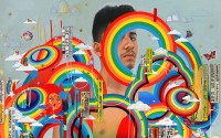
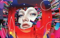
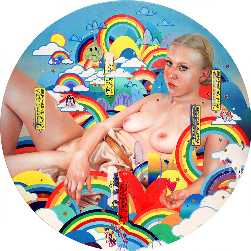
The artwork merges subjects with abstract elements like rainbows, skulls, orcas, unicorns and smiling faces that tend to have strong associations on their own. Do you gravitate toward such images, and are they meant to complement or contrast the nude subjects?
The sticker aesthetic is used to interject an immediate reaction to the work. In this case it’s nostalgia, for many. I wanted the viewer to have an immediate affection for the work, even without over-analyzing the content. I also found that Millennials are responding to the work a bit more, as opposed to Gen-X’ers for example. This means people born from 1980 to 2000 took more of an immediate interest in the work. Let me add, I am a Millennial/Gen-Y’er.
I purposefully used vintage stickers from the very late ʼ70s to the ʼ90s to trigger this effect. Mostly incorporating Lisa Frank, Rainbow Brite and generic stars and sparkling smiley face stickers—the smiley face stickers I actually made myself from glitter paper. This aesthetic is also used to put the viewer in a state of fantasy, so the stickers should theoretically complement the work.
Death from Above: The End Is Nigh features imagery associated with youthful happiness and imagination contrasted by the breaking heart and ominous title.
This is one of my favorite pieces. It brings the show together and sets the tone. The painting is illustrating the end of this fantasy world. A world of perfect harmony, a world occupied by immortals, a utopia. I wanted to show the darkest day of the brightest world. This is the general theme of the entire show.
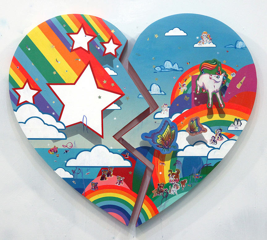
Death from Above: The End Is Nigh
The subject in The End Is Near holds a skull, and her facial expression to me suggests deep thought. When creating the piece, what did you imagine she was thinking?
This painting shows one of the immortals resting in her utopia. The skull makes reference to the looming fate the immortal’s face as she fully embraces the idea of death. I wanted the figure and her surroundings to show a mild sense of vulnerability. You can take it there…
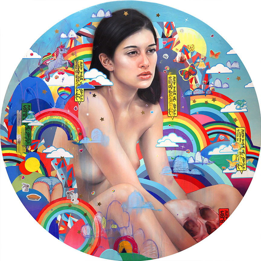
The End Is Near
Where the Gods Go is a fascinating piece in many ways, but I am particularly curious about the title itself. What made you think of deities when you named this piece?
This piece also illustrates the immortals in their utopia. Every figure in this show is supposed to be a deity. If you take a look at the mostly yellow dialogue bubbles, you’ll see that the first word is scratched out or colored over. The bubble says “Immortals, The End Is Near.” You can also see that the bubble arrow is pointing down, suggesting that someone below them is stating this. I picture this as a form of “Heaven.”
The alphabet I used is my own coded alphabet. I collaborated with a graphic designer for months to come up with the forms. We made three different typefaces: A thin-lined typeface for the dialogue bubbles, a chubby balloon-like typeface and a thick propaganda-ish typeface. I wanted them to look familiar but impossible to read or understand. The viewer should know that there is a narrative happening in each piece, but I wanted the viewer to be moved by the overall aesthetic rather than the direct narrative.
Where the Gods Go
What emotional and aesthetic elements do you look for in the nude subjects?
For this show, I wanted the subjects to be young, male and female. Unfortunately, I was only able to finish one male painting, though I had three others in the works. Gender and youth aside, I wanted the figures to be interesting looking… but also a bit plain. I photographed the models nude and with no make-up. The few that have clothes were added after the fact.
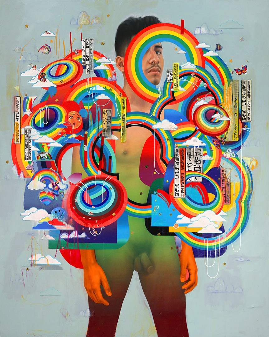
The Giver
You describe the nude subjects as “aesthetic anchors.” What are they anchoring?
That was a response to the work in my last solo show at Dorothy Circus in Rome. In that body of work, I tried to be a bit more sporadic and chaotic with the shapes and color. The realistic figures were meant to hold the paintings together, aesthetically. They were used to ground the chaos and give the eye a resting place.
You work with multiple mediums. Are there any particular mediums that present larger challenges when used together, and if so, what is the pay off in using them together?
I use multiple mediums, honestly, as a crutch… ha! I have never been a great painter, but I can use colored pencil and wax pastel very well. The paint that is applied to the figures is done so by glazing or even transparently with an airbrush. The one challenge that always seems to pop up is dealing with tape ripping off parts of the figure. I have developed ways around that, but every show it happens, and I have to deal with it. My process has become more about problem solving. But it keeps me on my toes!
In what ways does Twenty Sixteen reflect how your style has evolved in the past year?
For one, I’m incorporating narrative in the work. I have a history in comics, and when I started doing “fine art,” I completely rebelled against narrative. I have now fully embraced my background, which includes comics, graphic design, cover illustration, fashion, t-shirt design and my cartoon and toy obsession. Get ready for some wild shit.
Twenty Sixteen, I assume, is a reference to the current calendar year. Are the images meant to represent something about this year or moment in history?
Yes. Showing at Jonathan LeVine Gallery meant a lot to me. Many of my favorite artists have been or are a part of this gallery. When I was asked to do a show there, I jumped on the opportunity, it being a milestone in my eyes. With that being said, I made Twenty Sixteen the year the immortals are prophesied to parish. Representing the fall of an idea that I’m moving away from. More of this concept will be discussed in the book I’m currently working on, Everything I Was. The next few years will be a concentration of art—painting, mostly—and brand with product and its context in the art and commercial world.
Originally featured on PRØHBTD